MAX is such a ripoff
05 October 2005 at 1:04 am
I’m not talking about Macromedia MAX - the conference that is just two weeks away. That will probably be a brilliant venue! I’m talking about Microsoft MAX - a blatant ripoff from Apple’s iPhoto. Having watched the Sparkle/Avalon presentation with Mano, I had really high hopes for the first publicly released (beta) software based on WinFX and the new architecture. I was SO disappointed!
During the Sparkle/Avalon video, one of the Microsoft employees giggle and says “I can’t believe I said that” after commenting that a gizmo he made looks just like the Apple nav-bar. The engineers appear to think it’s fun to be able to rip off others ideas in just seconds. Sure - it’s very easy to make such a navigation. I could probably code one in less than an hour using Flash. Everything is easy when someone first show you how to do it right, isn’t it? Duhhh…
I’m not a Mac user. I have a monster 5,5 kilo Toshiba P20 portable that I lug around. Like every computer user, I have a love/hate relationship to my machine and the makers of the OS and software. I enjoy the speed, the stability of XP and the amount of applications/games I get for the PC, so I won’t switch just yet. But being in the PC-camp, I’m sort of embarrassed at how much of Apple’s ideas Microsoft can steal and get away with. Microsoft MAX is yet another such thing.
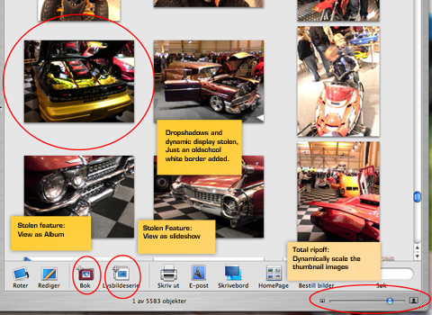
Microsoft Max is sort of Apple iPhoto, but with only fractions of the features. MAX sports a slick 3D’ish look - almost alike what Apple have used the last years, but with a MS twist to it to avoid lawsuits. Aqua-like 3D buttons and brushed metal surfaces. They’ve ripped the smooth scaling of all images in the album, they way each image displays (with an extra white border that is - how creative?), a crappy slideshow with next to no settings and the sharing aspect. That’s about the features that are there. It’s truly sad to see MS developers raving about how cool the app is. It’s not cool at all. It’s a Beta, a poorly made ripoff and it looks more like an Alpha to me? The usability is so poor! I really hope MS does not intend to ship something like this. I’m an experienced computer user and after starting the slideshow feature, I used several seconds to find my way back.
MAX uses two arrows in the upper left corner as the main navigation in addition to a horizontal navbar-like thing. Having used a computer before is probably a drawback here, since they indicate that they may change the basic navigation metaphors we’re used to. Another funny thing: the app has those nice round corners that the design community is starting to grow tired. Flash users have made applications like this (and more creative) for many years already using third party wrappers/Projector tools. I’m downright disappointed. Even the Album functionality from iPhoto is ripped (and executed poorly). If you don’t have access to a Mac, here’s an image from my wife’s iBook showing iPhoto and all the features they ripped.
Who knows maybe the next feature they’ll add is a “rotate image-button” or maybe they’ll just rip the dead simple way you can order paper copies from iPhoto? As a PC user, I’m ashamed…
