SafeFrames for mobile apps
25 October 2012 at 8:38 am
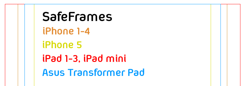
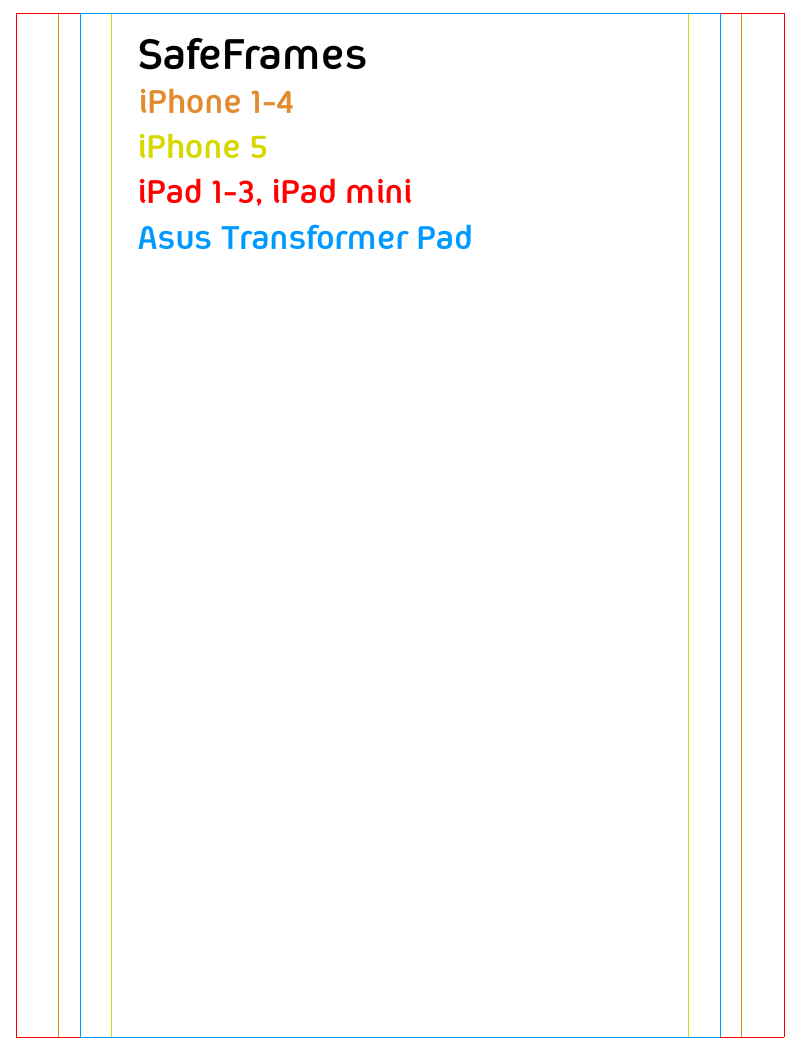
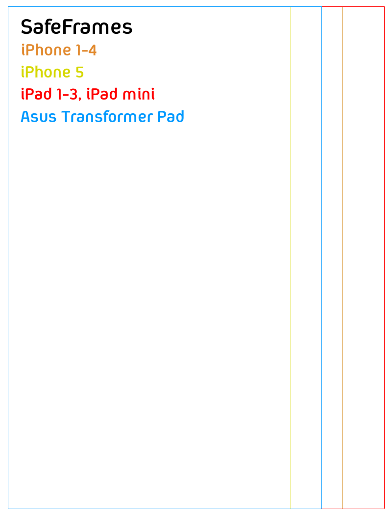
When designing a mobile app for multiple devices and resolutions, it’s important to know how the different aspects can limit the positioning of design elements. For a recent project, I made some SafeFrame images that the designer can overlay to make sure all important elements are within the limits of typical iOS devices and a popular Android tablet that we target. I guess this can be useful to others so here’s the image for centered designs and here’s the image for Left-adjusted designs (transparent PNGs).