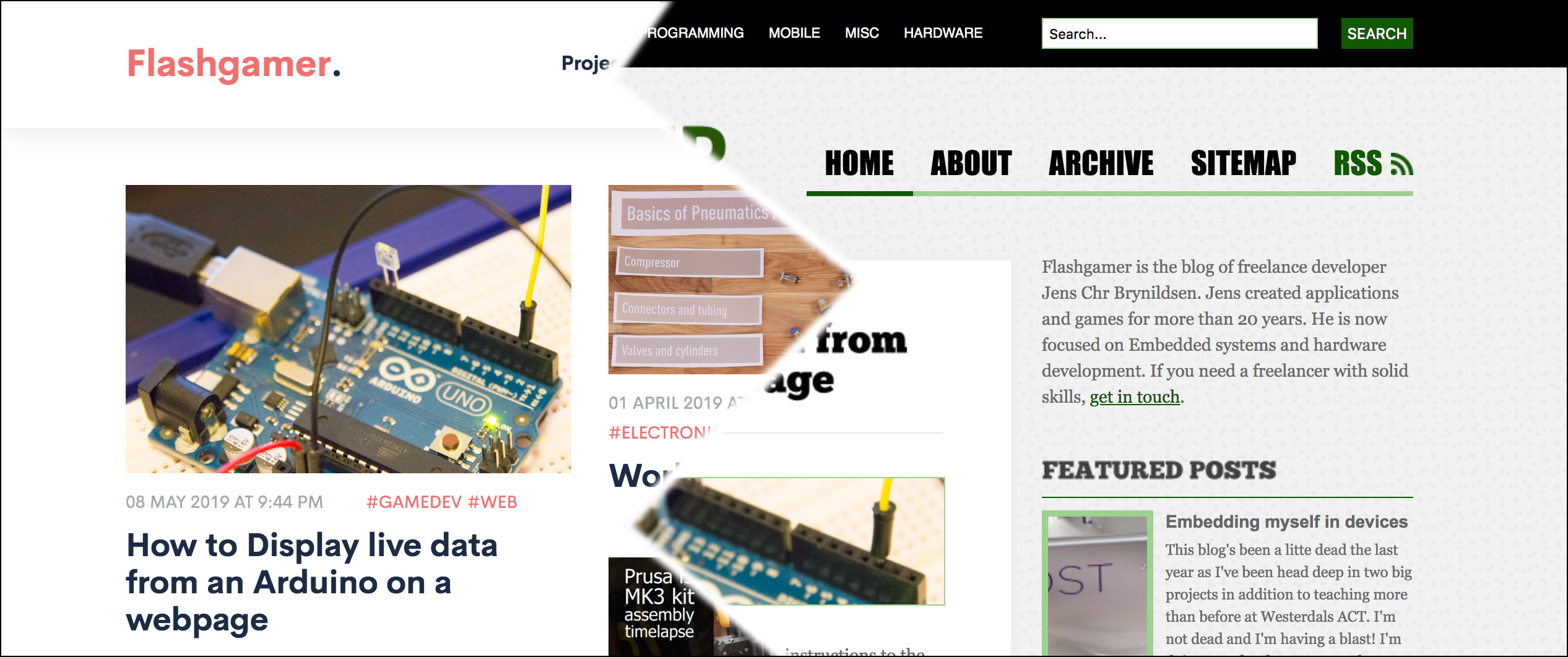
Time for a refresh!
10 June 2019 at 1:29 am

The current design of this blog had not changed much since 2011, so it was about time for a refresh. The new design is minimalistic, but makes better use of the screen size of modern machines. It also works really well for mobile and I’ve switched to DigitalOcean as my provider.
The 2011 redesign updated from an standard template that came with Movable Type (MT). MT was the big blogging platform back when I started blogging on this domain in 2005, but it was soon surpassed by Wordpress who still reigns the blogging throne today. I’m not using Wordpress though. That would just be too easy? As with the second redesign, I’m using ExpressionEngine - a CMS based on the LAMP stack that is incredibly flexible. The fact that it’s not as big as Wordpress helps in many ways, making maintenance much easier.
Transistion
My old ISP, EngineHosting, got bought out (or had a focus-shift) some years ago. In August they’ll turn off the server, so I had to find an alternative. Over the years I’ve become much less afraid of the command-line, so now I’m running this off a Droplet on DigitalOcean. I’ve used them for hosting all sorts of projects the last few years and they’ve been very solid. I typically make a $5 staging server with them that I them that I then transition to something more powerful when the development phase of the project is done. Running off a stripped down Ubuntu that I have full access to, feels a lot safer than my old ISP.
I initially wanted to just pull the files off the old server along with the database onto the new server, but that became too complicated. It was simply too many PHP versions since my old server was updated, so I couldn’t just Click my way through the upgrade wizard. Oh well. I had hacked the old template to be Responsive, but I wanted something looking a little less dated. I found a nice template from ThemeForest and used that as a base. The end result feels clean - almost too clean? It’s so clean it’s kinda boring actually, but it’s still better than the old design. It’s a little annoying that the template I opted for makes use of jQuery (shouldn’t really be required), but it does the job.
Nice, new features
The main page uses Masonry.js to solve CSS placement. I really like this Pinterest-style of displaying content and the template came with a “Load more” button. Better make that work, right? Turns out that’s there’s no standard way to do that, but a simple XMLHttpRequest does the trick. Re-triggering Masonry was tricky though.Took me maybe 2 hours to find a good explanation here. The reason it took time was that I didn’t know the right words to search for, so I randomly stumbled upon the answer when looking up an error message I got. It’s in the Masonry FAQ also, but I didn’t get to that from searching. The end result looks quite smooth on most platforms (Safari on OSX renders stuff a little odd).
The template has some other nice scripts like video embedding based on Plyr, a pretty well featured solution that embeds and plays back video from Youtube and Vimeo, but also lets you do custom players for HTML5/JS. If I add a video link to an article, I can now set that to replace the Article image very smoothly as in this example.
The entire move, including restoring of all posts (300+) from 2005 until today and redesign took about 2 days, so not shabby overall. I’ve also made sure that all content is on the same URLs as it was before, so Google should stay happy.